Showing posts with label UX. Show all posts

Monday, August 17, 2015

Business Process – the missing element from Delve?

Microsoft Delve is an interesting new cloud product that attempts to bring together the many information sources a typical enterprise business user is interested in so that they can make sure they know what they need to.

It is often simplified to talk about finding people through content, or content through people.
image
Leaving aside the similarities with stalking work colleagues, it does seem to offer some value. One potential use case I heard of was finding all presentations presented to me in the last 12 months.
Delve is based around the Office Graph, which gathers data from across Office 365 and other tools (even eventually ones from ISVs). The idea seems simple enough:

The two relationship types they currently support are “Trending Around” (content related to a specific person) and “Working With” (people working with a specific piece of content). Graph edges are relationships and the nodes can be people or content (documents or conversations).

Clearly this could be very useful, but I think the missing element is business process.

Now traditionally we have represented the business process in a number of ways. perhaps it was the location (e.g. a Virtual File), a piece of metadata (e.g. project name), or just when it occurred (e.g. Collaborate 2015). These are all fairly imprecise, and one of the issues with business process as an idea is that you can have more than one present at a given moment in time.

For instance, this weekend I ended up paying $36 for internet access at the hotel my employer had our annual conference at. I am planning on expensing that amount on Monday. There are three business processes this involves:
  1. The expense reimbursement business process.
  2. But the expense was only necessary because we were offsite at Activate 2015, so it was part of the Activate conference.
  3. The internet access was required because my flatmate at the time needed to upload a user research prototype for our Connect product.
I would expect that the expense reimbursement could show up any one of these three. Either a query about all employee (or my specific) expense reimbursements, a query about Activate 2015 activities or a query about the user research for the next phase of Objective Connect.

In a graph we could add business process as another node, but that doesn’t involve it in the relationship between person and content the way we would want to. However, custom content types are going to be added soon, so the API would allow us to add a business process node easily enough. But would we link the piece of content, or the person to it?

We could make it an attribute of relationship, but that might limit our ability to query it (or not – see the idea of looking for content presented to me). Given there is a potential one-to-many relationship between a given edge (relationship) and business processes, it might requires changes to the Office Graph from Microsoft to give us that functionality.

There is another technical problem, which is how do we capture the relevant business processes that are involved in these person/content relationships? Do we ask users to act like lawyers and specify at every minute of the day what business processes they are involved in? Do we merely make them hashtags and allow people to tag everything they do, if they choose to do so? Is there some automated process that will prompt people to classify their content based on the meaning detected in the words they use?

Personally I think there is some real value in using hashtags – but they must be understood in the context of that person’s role, activities and context. So I might have tagged that expense reimbursement with these hashtags:
#expense  #Activate2015  #ConnectUX
But they way those might be interpreted might vary by context. For example, #expense will be associated with the sort of expenses I am allowed – perhaps “discretionary travel expenses”. Further to that, #ConnectUX will be regarded due to the time period as relating to the Connect user experience research being conducted between the 10th and 21st of August.

Those context variations to the hashtags require some rules, some intelligence, be applied to my hashtags in order to derive a better set of processes. That is hard, and that is where I would expect an app might want to call out to <handwave> (Cortana and the Office Graph?) to find info that would help solve the problem. We would also want other apps (CRM, ERP, etc) to support this sort of tagging, so their content could be properly understood as well. It sounds improbable, but interesting I think …

More info about the actions available as edges.

Tuesday, October 21, 2014

Collaborate 2014 Roundup

We just finished another Collaborate conference for Objective Corp's international customers and it was a great effort by all; staff, partners and customers included.

The amount of effort that goes into the event is extraordinary, but the payoff is an event that informs, excites and inspires our customers to get more value from their Objective products (ECM, ECC and Connect) and change the way their organisations impact the world.

A big part of that is helping them drive business process innovation so they can deliver better services and products to the public.

Business Process Innovation

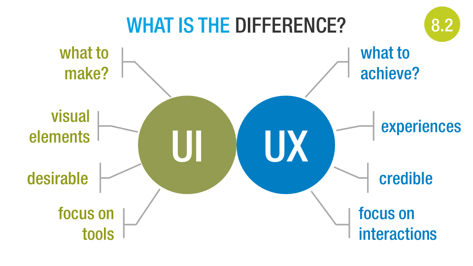
Something we are doing across our products is looking to deliver great user experiences, especially ones that are customised for our customers' organisations so that they are received by their end users with credibility.

One of the challenges that raises is what an old colleague of mine used to call the "pink flamingo effect":

Pink Flamingos

This is the tendency of some people to go wild with any sort of HTML customisation and add what they assume is an attractive element (e.g. pink flamingos) to an otherwise functional page.

We can't prevent that altogether, but a big part of the move we're making is to educate customers about the sorts of things they should consider customising (logos, fonts, colours) and how to consider the user experience when customising things that we have carefully designed, such as our responsively designed sample email templates.


To that end the slide above was used to help explain the difference between user interfaces (UI) and user experiences (UX).

Edit: See more about UI vs UX at my colleague David Eade's blog.

Friday, January 18, 2013

You need consumer-grade usability

It’s interesting watching the English language evolve in response to technology and changing cultural ideas. Take the term “consumer-grade”, this used to (and sometimes still does) mean, lower quality, less robust construction.

Compare it to “weapons-grade”, a term commonly applied to uranium and plutonium, but simply meaning it is a substance pure enough to to be used to make a weapon or has properties that make it suitable for weapons use. “Export-grade” is similarly used to define food or beverage that is better than average, and worthy of consumption away from its place of production. Some people seem to confuse the two.

sign-24092_640 (1)

So you might be confused by someone espousing “consumer-grade usability” as a good thing … confused that is, if you lived in 1999 and knew nothing about the history of consumer devices in the 21st century … you know, the whole iPod, iPhone, iPad, Alienware, LCD televisions, Android and “just google it” thing?

Now that we are living in an increasingly BYOD world it is obvious what the term means. It is a purity of user interface design that brings the essential features of the device or application to the fore, and frees anyone to use it with confidence and passion.

It’s easy to see how this came about, “consumers” includes everyone, “enterprise users” are a small subset of the working population, itself a subset. When creating for the consumer it has become obvious that success increasingly comes from great usability – even when competing in the budget end of the market. This means everyone gives usability lip-service, hence the rise in usability consultancies.

Consumers have access to free tools that are developed with such care that they make the average enterprise application look clunky in comparison – and they are beginning to get sick of it!!

The challenge as I see it is how do I as an enterprise product manager bring consumer-grade usability to my products, without making people see it as just a gimmick, or a band-aid fix?

Update: The Consumerization Revisited – Why Aesthetics Matter article from QlikTech points out that aesthetics matter when it comes to usability and user adoption.